My new website is live!

Friday, April 29, 2011


My new website just launched today!  It has been quite the project the last few weeks, but it feels great to finally have it up. I am using a portfolio template of Other People's Pixels, which seems to be a popular choice among artists.  The back-end was a little tricky to navigate at times, but all in all, the site came together without any major glitches.  And for those who don't have an Etsy account, my art prints are now available for purchase on my website -yeah!  Just click here to start browsing. 


In other news, I want to remind all local folks about the Rieke Art Fair this Sunday.  One of my friends is an event organizer, and the fair benefits a local school.  I just came back from setting up my booth, and I'll be sitting next to one of my favorite local artists, Jill Bliss.   Jill will be selling her lovely posters and stationary at the event.  I'm planning on bringing lots of prints (including some samples that are marked down) and my latest original works.  Here are a few that I completed this week. 


When the forest sleeps, 8" x 8", mixed media on wood panel


Poetic pond, 4" x 4", mixed media on wood panel


Panorama, 9" x 12", marker and ink on recycled drawing paper


White horse in meadow, 4" x 4" and Fawn and mother in forest, 4" x 4".  Mixed media on wood panel.

Embroidered chairs by Peter and Sally Nencini

Thursday, April 28, 2011


I'm in full-fledged covet mode over these embroidered chairs by Peter and Sally Nencini.  The talented duo transforms old chairs into functional works of art.  Peter creates the designs, and Sally reupholsters and embroiders. 


I'm a big fan of Bauhaus art (Kandinsky and Stölzl), so it's no surprise that I'm so keen on these geometric and simplified designs.  Add fabric and midcentury furniture into the mix, and it becomes my kryptonite!


[image source: Peter Nencini]


. . . I am powerless.


For more creative awesomeness/torment, visit Peter's blog and Sally's website.


Trying to maintain my sanity

Monday, April 25, 2011


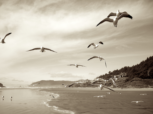
A day at the beach, one of my new original works.


I'm still chipping away at my goal of 40 originals in 60 days.  As if that's not enough for me, I've added two other big projects onto my plate.  One is a new website that I'll hopefully reveal in a week, and the other is the biggest art giveaway ever!  The giveaway event is not for another month, but, trust me, it's worth waiting for.


In the meantime, I thought I'd share this video interview with New York based artist Andrew Kuo.  I was first introduced to his wonderful work when reading this book


New retailer, plus new work

Friday, April 22, 2011


A collection of my prints can now be found in local Portland shop, Tender Loving Empire.  This downtown shop is packed with lots of goodies for the indie art and music lover. 


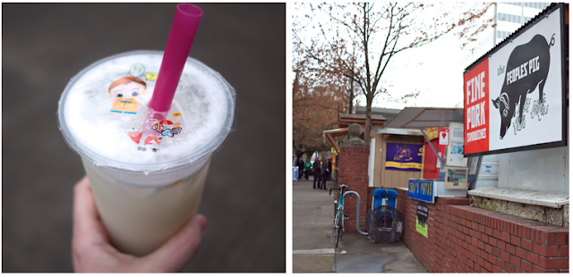
And just a block away is one of my favorite places to lunch- the food carts!


On the menu- Lychee bubble tea and a pork sandwich. 


Yesterday, I uploaded a new wood panel piece into my Etsy shop.  


Together


I have been working on a few dark paintings, and this was my moment of reprieve.  Instead of black mountains, this piece features a meadow with deer and a pastel colored sky. 


The magic of pinhole photography

Tuesday, April 19, 2011


Leigh-On-Sea, Geon Park, United Kingdom


In a few days, many pinhole photography enthusiasts around the world will be grabbing their makeshift cameras and uploading their images onto this site.  Sunday, April 24th marks the annual Worldwide Pinhole Photography Day.  Pinhole photography involves taking photographs using a light-tight container with a tiny hole on one side.  Light travels through the pinhole opening and exposes photographic paper or film on the inside of the container.


When I taught high school photography, pinhole photography was one of my favorite class projects.  I wanted students to grasp the idea that a camera is basically a box.  The word camera comes from the Latin term camera obscura, which means "dark chamber".  Some students would choose to build their cameras out of cardboard, and others would bring shoeboxes from home. 


The first day of shooting and developing pinhole pictures was always an exciting time. And the learning curve was high as students problem-solved issues concerning exposure.


mon velo, Ginou Hocedez, Belgium


This photo of a bike wheel is very similar to the kinds of photos taken by my students.  There was a bike rack outside my classroom, so every year, I would see a number of photos featuring bicycles.  And, like this photo, the images taken by my students were negatives.


All the photos shown here are part of an online pinhole gallery, with thousands of photographs catalogued.  These are several of my favorites.


Rowboats Beached on Misty Day, R Aber, United States


pinhole on the cliff, Teerapan Leelavansuk, Thailand


*, Petr Mahdalik, Czech Republic


untitled, Xavier Brunetière, France


Laatefoss, Bjorn Rannestad, Denmark


sweet home, Volkmar Krause, Germany


Check back this Sunday for the 2011 exhibition.  Even if you're not planning on submitting a pinhole picture, you don't want to miss out on more amazing pinhole photography from artists around the globe.

Sneak Peek of new work

Saturday, April 16, 2011


In the next 60 days, my plan is to kick out 40 new originals.  A lofty goal, I know! This was week one, and I'm proud to say I finished four new pieces (three of the works shown above).  Hopefully, I'll finish the fifth work this weekend.


The new work is for two upcoming art events.  The first event is the Rieke Art Fair on May 1, which is a fundraiser for a local Portland public school.  There are a total of 29 participating vendors, including Jill Bliss whose beautiful art is on the promotional flyer.  I'll be bringing my prints along with my originals to the event. 


The second event is a featured artist show at Tilde in July.  The mixed media work on the left (in the first picture) will be part of the show.  There is an artist reception on Friday, July 1 from 6 - 9p.  As we get closer to this date, I'll be sure to "reveal" more pieces for the event. 

Comparing art: Karen Margolis and Frocky Jack Morgan

Wednesday, April 13, 2011


[image source: www.karenmargolisart.com]
This stunning sculpture, Continuum, was created by artist Karen Margolis.  The clusters of pods and tulip-like shapes are made from maps and handmade papers.  If you look closely in the photos, you'll see the incredible textured effects of a soldering iron.  I have to say that those are the most beautiful burn holes I've ever seen!


The organic bunching of shapes and soft neutral tones in Continuum remind me of the fashion collection, Frocky Jack Morgan . . .


[image source: frockyjackmorgan.blogspot.com]
Designer Julia Barbee deconstructs clothing to create one-of-a-kind pieces, her specialty being wedding gowns.  It's no surprise that Barbee has a background in sculpture.  Like a potter, she handbuilds and molds, but with fabric remnants!


Like Margolis' paper sculpture, Barbee's wearable creations are delicate yet bold.  Lacey hems are unfinished or asymmetrical, and embellishments are never understated.  Although I tend to lean towards the "less is more" crowd,  I could never tire looking at the intricately layered works of Barbee and Margolis.


New print, "Glacier"

Saturday, April 9, 2011

Latest print, Glacier,  in a frame.


I have been wanting to meld my photography with my illustrative works for awhile now.  I didn't think it was going to happen anytime soon until I was about half way through my latest work, Glacier.  As you know, I love layering textures and patterns, and I was looking to add something to the composition in the upper right area.  The light blue cloud reminded me of a clear, crisp day in the mountains, and all of a sudden, I thought of this peak that I captured while driving thru central Oregon. Within moments, I had the image printed and cut out.


The drawing component was complete before I started adding photographic elements, so I had to be very precise in fitting the photographic images into the picture.  Good thing I was once a teacher and had to cut a gazillion shapes out of paper! For the rest of the evening, I went into a collage trance.  I found cutting and pasting to be very therapeutic, like crocheting.  I had so much fun with it, I'm looking forward to starting my next collage piece. 


I thought it was timely that I found this bear sculpture after finishing the Glacier piece.  The first time I ever spotted a bear in the wild was at Glacier National Park.  I was a young girl, and it was the highlight of my trip. 


Just like the wooden whale, I have plans for painting this guy. Not sure how I'm going to work around the deep grooves, but I'm always up for a good art challenge. 


And finally, one more wood panel piece that was added to my Etsy shop.  This one is titled Red Mountains.

Art is more than just a pretty painting

Thursday, April 7, 2011

Yeffe Kimball, Fawn and Spirits, 1942, oil on canvas, 19 in x 29 in, Portland Art Museum, gift of Dr. William K. Livingston.


I recently fell in love with this painting at the Portland Art Museum.  I tried to find more information about it on the internet but couldn't even locate an image.  I eventually contacted the museum, who is permitting me to use this image for my post. 


Information on the artist Yeffe Kimball (? - 1978) is scarce on the internet, but the little information I did find was fascinating and quite controversial.  Kimball,  who is a noted figure in the modern Native American arts community, is believed to have fabricated her ancestral connection to the Osage tribe.  This raises a lot of questions for me on how an artist's personal life impacts our opinion of their work.  Here we have an example of an artist whose artistic career greatly benefited from her cultural claims. Her works have hung in numerous museums and galleries, some dedicated solely to Native American art.   


I would be lying if I were to say that this doesn't bother me.  If Kimball doesn't have any Native American roots, then her work shouldn't be recognized as modern Native American art. 


Jackson Pollock, Number 1, 1950 (Lavender Mist),1950, National Gallery of Art, Ailsa Mellon Bruce Fund, 1976.


I realize that a lot of great art comes with controversy, controversy related to the art itself and controversy pertaining to the individual artist.  I watched the film Pollock for the first time just last week.  I have always been a huge fan of Jackson Pollock's art, but, while watching the movie,  I was reminded again of the details surrounding his tragic death.  While drinking and driving, he killed himself and a passenger in his car.  I struggle with the fact that his reckless actions took another life, and yet his painting, No. 5, 1948,  sold for $140 million dollars in 2006- the highest price tag for a painting to date. 


Art is not meant to be black and white, I get it.  And, as much as we like to talk about "pretty" art, sometimes we need to ask the hard questions.  So, what do you think?  Should the details of an artist's personal life have any impact in our response to their art?

12 ways to promote your Etsy shop

Wednesday, April 6, 2011


Fellow Portland artist, Anna Joyce, was featured last week on Etsy's "Quite Your Day Job" series.  She has invested a lot of time and energy into her creative passion, and it's paying off. 


My favorite blog posts on Etsy are the "Quit Your Day Job" features.  I love reading about "real" people who overcome obstacles to get to the place where they are today.  And the advice shared by the featured sellers is always so relevant, especially for Etsy shopowners just starting out.


One thing that I've learned from being a retailer is that passion is only part of the equation to a successful business.  Any product idea can sound brilliant to an audience of one.  If the goal is to reach the masses, then a whole lot of hard work and patience is in order.


Many shopowners underestimate how marketing is key to their business, especially when that business is exclusively online.  Before opening my Etsy shop, I ran an online retail store for two years.  It was a crash course on SEO, conversion rates, and email marketing.  In the beginning, it took a lot of work to build up our customer base and create a more seamless shopping experience.  But, within a year, our online shop was bringing in 25% of our monthly gross sales (the other 75% was sales from our brick and mortar shop). 


Marketing, in my opinion, is the most difficult aspect of running a small business.  It demands a lot of time and, in most cases, a bit of monetary investment.  I realize that most Etsy shopowners do not have a large marketing budget, if any at all.  The reason I opened up an Etsy shop in the first place was its hassle-free setup and low maintenance cost.  Promoting your Etsy shop, however, doesn't have to break the bank.  Here are some practical marketing tools that can help bring customers to your shop. 


1.  List new products in your shop at least twice a week.  Every time you list or relist a product, the item is moved to the top of Etsy's search queue. 


2.  Connect with Etsy sellers/buyers through treasuries, forums, and teams. 


3. Advertise on creative blogs.  Sponsorship rates differ from site to site, but many blogs just charge $30 - $45/month. 


4.  Start your own blog!  (More on this in an upcoming post.)


5.  Keep your brand consistent.  From your shop header to your business card to your packaging, customers should know what your collection is about and how it's unique from all the other great shops out there.  Read more on how to create a brand identity here


6.  Subscribe to Etsy newsletters to follow current trends and opportunities.  Go here to sign up. 


7.  Tag your products with search friendly keywords.


8.  Use social networking sites like facebook and twitter to promote new products and follow other like-minded artists.  Try to connect with fans on a regular basis. 


9.  Run promotional events from time to time.  Everyone loves a good sale.  Share special events and collaborations with bloggers that promote such activities.    


10. Know where your customers are coming from.  Follow traffic to your shop using Google Analytics or StatCounter. 


11.  Consider wholesale accounts.  I have found that jewelry and art collections sell much quicker in brick and mortar shops than online.  Before you contact a retailer, make sure you do some research and know that it's a good fit.  See my post on how to contact shops here


12.  Superb customer service is gold.  When your customers are happy, they will come back.  And they will let others know!


This list should keep a few of you busy for awhile.  Remember,  promoting your shop takes time.  But stay at it, and you will eventually see a return on your marketing efforts.

New 11 x 17 limited edition print

Monday, April 4, 2011


You might remember this design that I had started in November.  It's also the embroidered piece that I was working on in my Etsy interview.  My initial plan was to make a handful of embroidered wall hangings, but the project idea had moved down my priority list the last few months.  Then, in recent weeks, I received some inquiries about larger prints.  I happened to have some 11 x 17 sugarcane paper in stock, so I made a test print of the new design just this morning.  I was quite pleased with the way it turned out, and to create a little more pop in color, I added a few handcolored touches. 


The run is a limited edition of 50 prints.  To read more about the new print design, see the listing here


I also finished a couple more small wood panel pieces this week. 


Moonlight


Rising Sun


When I was working on Rising Sun, I was thinking about Japan.  I wanted to create something simple and calm.  The title refers to the country as well as the idea that the rising of the sun brings a new day.

Friday, April 1, 2011


For Spring Break, I was able to escape to the beach for one day.  It was rainy, windy, and cold, but still so beautiful.  That's the Oregon coast for you.  


In the brief moment we tolerated the brisk weather, I managed to snap a few pictures with my new (used) camera.  I wanted a more portable digital camera to stash in my bag at all times.  And, as much as I love my iphone, sometimes it just doesn't cut it when there's a prime photo op. 


I look forward to putting the new camera to good use and sharing more photos with you!